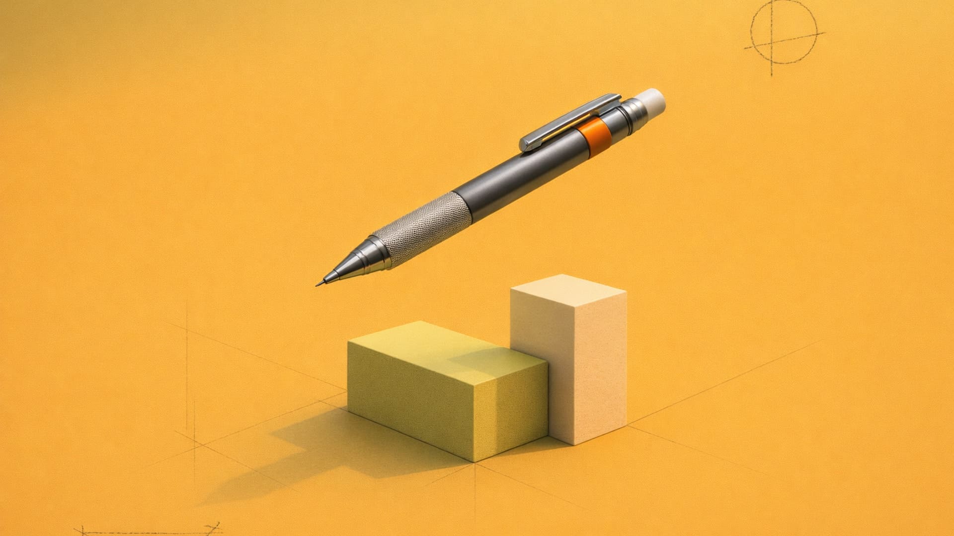
18 Professional Sketching Techniques for Designers
Learn 18 professional sketching techniques for designers, from construction methods to rendering and digital tools.

Behind every confident sketch is a foundation of spatial thinking that establishes proportions and perspective before diving into the details that make a concept compelling.
This guide walks through professional sketching techniques organized by workflow stage, from initial exploration through final presentation. Some of these you already use. Others might fundamentally change how you approach early ideation or client communication.
5 Fundamental Construction Techniques
Proportion problems emerge when you add details before establishing spatial relationships. Fundamental construction techniques help you build that foundation so your sketches hold together as you develop them further.
1. Crating (The Box Method)
Crating defines spatial boundaries by building transparent boxes around concepts, which is why it's also known as the box method. This box creates a structural framework for maintaining perspective accuracy and proportional relationships.
A pair of headphones might not be box-shaped, but crating it within a rectangular footprint maps the spatial envelope your design occupies.
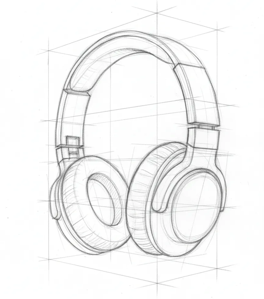
A chair might curve, but connecting it to structural elements at right angles ensures your perspective stays consistent when you add details.
2. Through-Drawing (Ghosting)
Through-drawing is the practice of rehearsing your pen or pencil movement above the paper before committing to the actual stroke. Rehearsing a drawing motion above the paper surface multiple times before making contact builds muscle memory and line confidence.
To practice through-drawing, trace the intended path repeatedly until the motion feels natural, then commit to the actual mark. This practice-before-commitment approach produces the clean, deliberate linework necessary for professional presentation sketches.
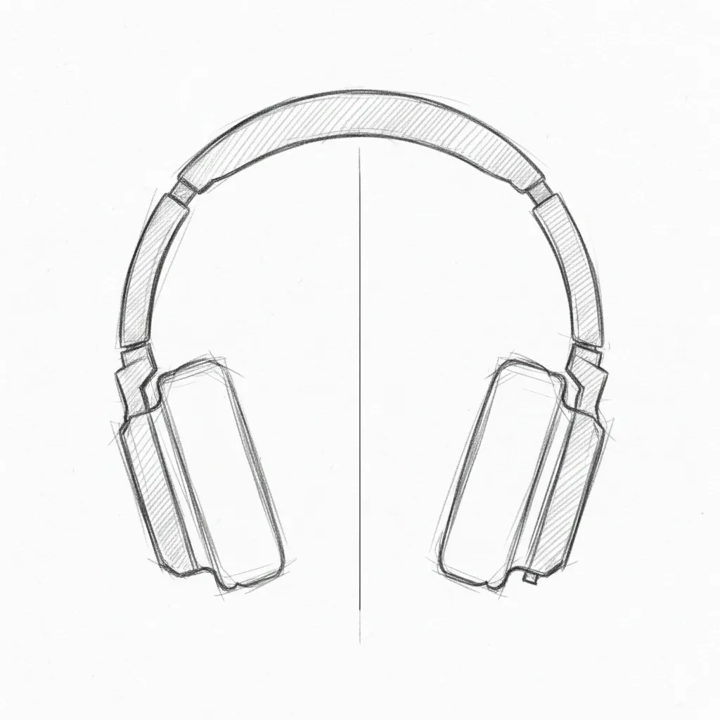
3. Axis of Symmetry
The axis of symmetry maintains bilateral balance with central guidelines. Most product designs contain symmetrical elements, from headphones and appliances to automotive designs and furniture pieces. A central construction guideline maintains bilateral symmetry and ensures proportional accuracy across mirrored elements.
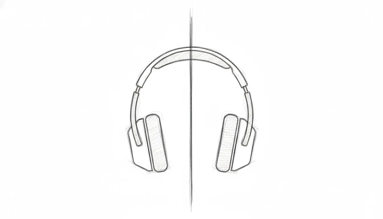
Place the axis first, typically as a vertical centerline, then build symmetrical elements on either side. When one side looks heavier or extends further than the other, the centerline makes that imbalance immediately obvious.
4. Cross-Contouring
Cross-contouring describes three-dimensional volume with lines wrapping around surfaces perpendicular to the central axis, helping you communicate dimensional information difficult to convey through outline alone.
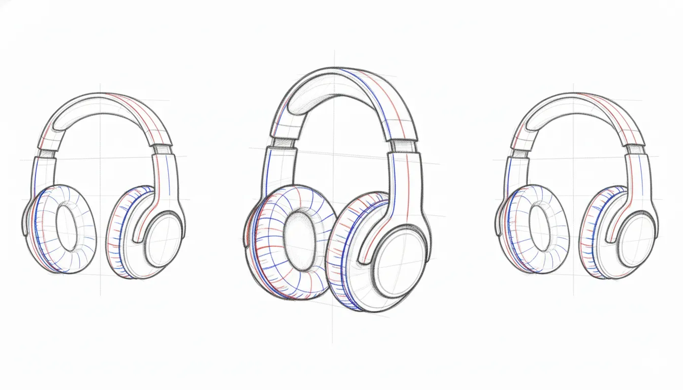
For a simple sphere, cross-contour lines would circle horizontally around it like latitude lines on a globe. For product forms, these lines follow the actual surface geometry, revealing how planes transition and surfaces curve.
5. Line Weight Hierarchy
Line weight hierarchy creates depth through deliberate thickness variation. Varying line thickness deliberately creates visual priority and depth in two-dimensional sketches. Heavier lines indicate foreground elements and important edges. Medium lines define primary form outlines and major transitions. Lighter lines represent background elements, construction guidelines, and subtle details.
4 Ideation and Exploration Sketching Techniques
Rapid exploration in early stages generates more viable directions than perfecting single concepts. Explore numerous directions efficiently rather than rendering finished ideas to presentation quality before you know which directions warrant investment.
1. Thumbnailing
Most designers start the prototyping phase with thumbnail sketches. This means creating rapid sketches of proposed physical forms that answer elements of the design brief without detail refinement.
A common trap for emerging designers is fixating on one idea and rushing to polish it in Photoshop or CAD before testing whether the concept actually works. Concept sketching should focus on generating feedback and exploring the design space, not producing finished visuals. Thumbnailing addresses this by forcing rapid exploration across multiple directions.
For example, when Anushuman was designing his Bloom Lamp, he made a couple of sketches with the initial concept of what he envisioned his lamp would look like:
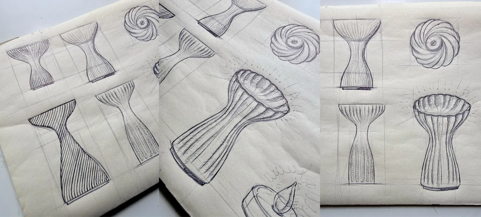
Prioritize quick iteration and feedback cycles rather than rendering finished ideas to presentation quality.
2. Silhouette Sketching
Silhouette sketching strips away surface details to focus purely on a form's outline. This technique reveals whether your basic shape language works before you invest time in rendering materials, features, or fine details.
A strong silhouette reads clearly at a glance and communicates the product's character even without internal lines. If your proportions feel off or the form lacks visual interest as a filled shape, no amount of rendering will fix that underlying problem.
3. Underlay Sketching
Once you've identified a promising concept direction through thumbnails, refine the proportions. Rather than redrawing from scratch and potentially drifting away from what worked, trace over the existing sketch, photograph, or 3D render as an underlay and make targeted adjustments. This approach maintains proportional accuracy while enabling rapid iteration before advancing to final technical documentation.
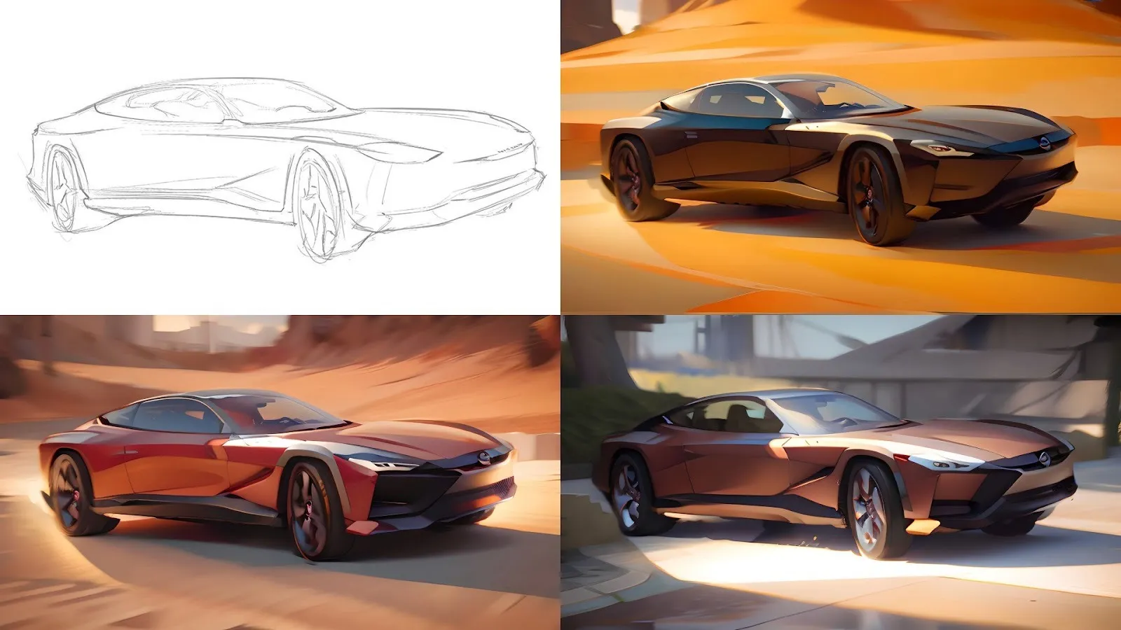
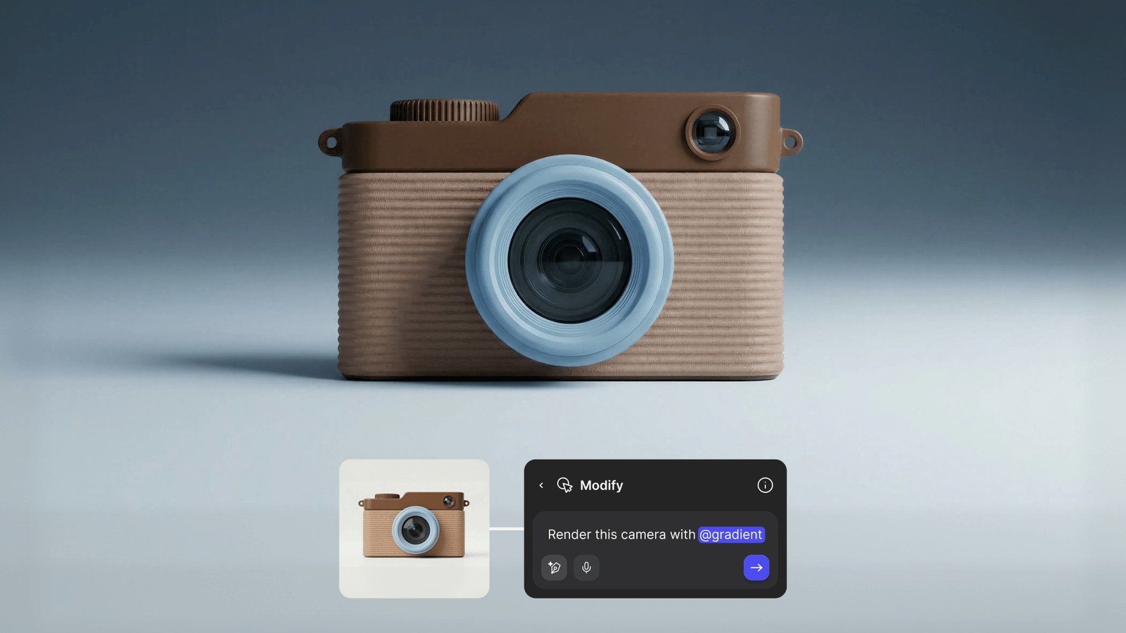
Traditional rendering takes several hours per concept, limiting exploration to a few sketches. Meaning if you have over 200 sketches, you won't be able to explore all possible design ideas.
Render turns initial concepts into photorealistic output in seconds, so you can evaluate whether chrome, matte plastic, or wood grain works best before committing to detailed modeling. Make 3D generates textured meshes from those renders, letting you rotate designs 360 degrees to check proportions from every angle.
[Embed: https://framerusercontent.com/assets/Ad203aLhnTN2EIlqMzF1pAK0Os.mp4]
Export to glTF for AR client presentations or STL for 3D printing prototypes, all without redrawing each version from scratch.
4. Orthographic Projection
Orthographic projection presents your design through standardized flat views, typically front, side, top, and back, without perspective distortion. Each view shows the object as if you're looking at it straight on from infinite distance, so parallel lines stay parallel, and measurements remain accurate.
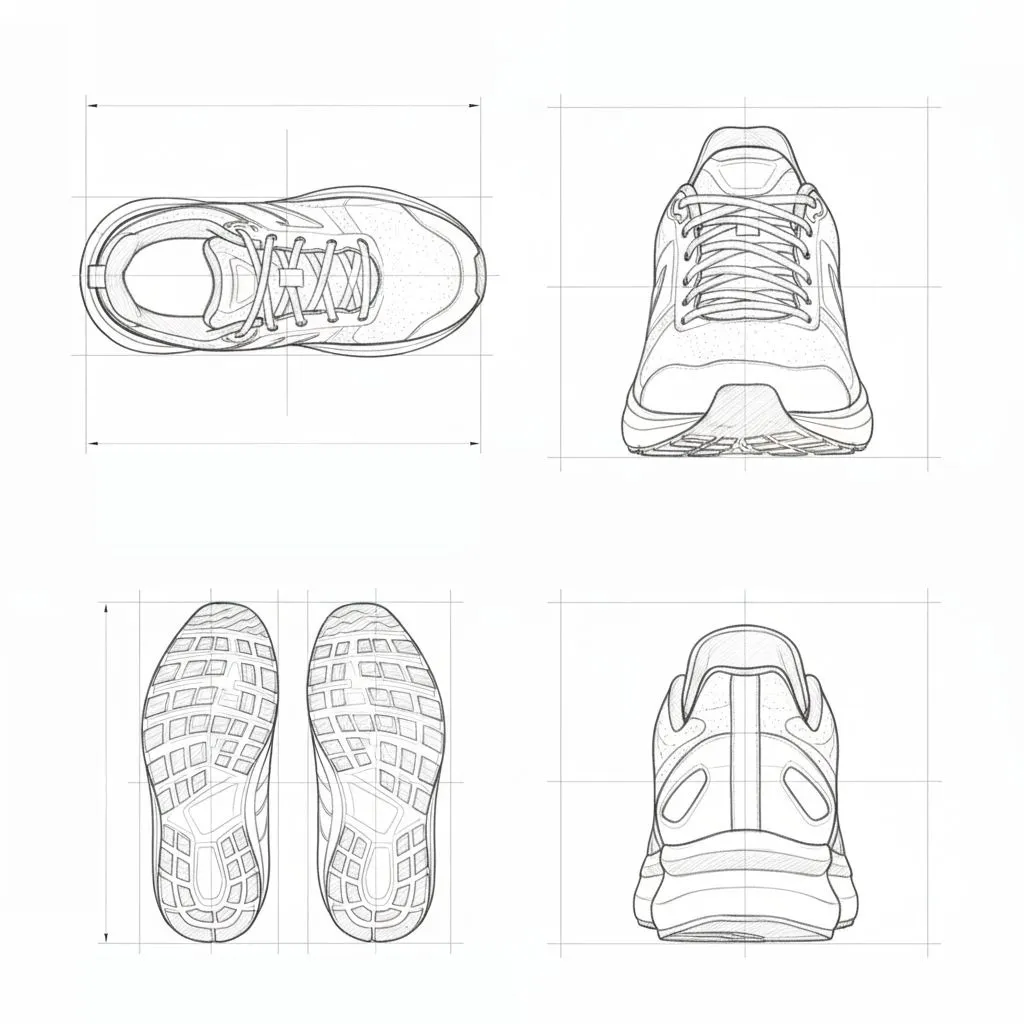
This technique bridges the gap between exploratory sketches and technical documentation. Engineers, manufacturers, and fabricators rely on orthographic views to understand exact dimensions and spatial relationships that perspective sketches obscure. A perspective rendering might look impressive, but it won't tell a machinist how thick a wall should be or how two parts align.
Create orthographic views after you've settled on a direction through thumbnailing and refinement. Draw each view at the same scale, aligned so features line up across views. The front view typically shows the most characteristic face of your design, with side and top views positioned adjacent to show depth and height relationships.
4 Visual Communication and Explanatory Sketching Techniques
Stakeholders understand assembly relationships, interaction in use contexts, and internal mechanisms without requiring technical drawing literacy when you use exploded views, callouts and arrows, cutaways, and storyboarding. These visualization methods communicate complexity through visual clarity rather than technical documentation.
1. Exploded Views
Sketches with exploded views separate parts along a common axis while maintaining their spatial relationships, showing how components fit together.
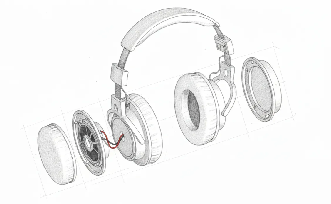
These illustrations improve product clarity by showing component relationships, identifying interference issues, and verifying assembly sequences before expensive tooling. The separation distance needs careful calibration. Too little, and components visually overlap. Too much and spatial relationships become unclear.
2. Callouts and Arrows
Adding notes of explanation with arrow callouts or callout comments clarifies specific details in technical sketches. In formal technical drawings, specify material specifications, critical dimensions and tolerances, assembly instructions, surface finish requirements, and functional requirements for mechanical interfaces.
3. Cutaways
Revealing internal components with cutaway views and sectional illustrations while maintaining external context helps throughout the manufacturing process. Show internal component placement, assembly sequences, and access points, cooling and ventilation paths, and structural reinforcement locations.
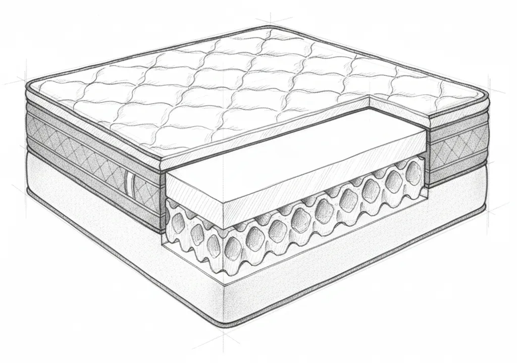
Choosing the right cutting plane is critical for effective cutaway visualization. Reveal internal components, assembly sequences, or access points without losing the external context that provides spatial orientation. Partial cutaways often work better than full sections. Cut away just enough material to expose specific internal features while leaving the rest of the external form intact for spatial reference.
4. Storyboarding and Scenario Sketching
The narrative format helps clients and design teams visualize product interaction and identify usability concerns without requiring functional prototypes. Focus on key interaction moments rather than exhaustive sequential detail. For example, a five-frame storyboard usually shows critical use scenarios more effectively than a fifteen-frame sequence that includes mundane transitions.
Apart from sketching, you can also visually render your ideas to get an even clearer idea of how your product might look in the real world:
Embed: [https://framerusercontent.com/assets/2ZaGqdyNld4s91cR6owwfY9y8o.mp4]
Include environmental context to demonstrate realistic use scenarios, and maintain a consistent perspective and scale across storyboard frames so viewers can track the progression easily.
2 Rendering and Material Indication Sketching Techniques
Material-specific visualization techniques form the foundation of professional rendering in product design. Chrome demands different marker sequences than plastic. Wood requires distinct approaches from glass. These methods require significant time investment beyond initial sketching phases, so deploy them deliberately on refined concepts that warrant detailed development.
1. Three-Value Shading (Highlight, Midtone, Core Shadow)
The foundational principle across all material rendering is layering multiple fills to create a dimensional understanding.
Lighter marker colors and intentional ink layering indicate surface reflectivity through highlights. Bright, concentrated highlights suggest glossy or metallic materials, while diffused highlights created through broader color blending indicate matte surfaces. Apply base color to provide the midtone, giving information about the object's inherent material color and surface quality. The core shadow at the terminator line, where the surface turns away from the light, defines the form's curvature and dimensional depth, with the specific color choices reinforcing material character.
2. Material Texturing
Chrome materials demand specific marker sequences for realistic metallic reflections. Professional marker rendering instruction uses Copic markers as the industry standard for rendering fundamental material families, including wood, plastic, and metal, based on their prevalence in industrial and transportation design studios and their superior alcohol-based ink system, refillable design, replaceable nibs, and extensive color range.
3 Digital Sketching Techniques
Professional digital sketching platforms generally provide stabilization, symmetry, and transformation capabilities that can improve your design workflow. Understanding each platform's specific capabilities helps you choose tools that fit your workflow, whether you prioritize portability, desktop power, or 3D integration.
1. Streamline and Stabilization
Line stabilization smooths out the natural tremor and hesitation in your hand movements, producing cleaner curves and straighter lines than you could draw unaided. The software works by averaging your stroke input over a short delay, filtering out micro-movements while preserving your intended path.
This matters for product sketching because confident, clean lines communicate professionalism and make forms easier to read. Without stabilization, achieving smooth ellipses or long sweeping curves requires years of practice. With it, you can focus on form decisions rather than fighting your own motor control.
2. Symmetry Tools
Product designers developing symmetrical forms may need real-time mirroring. Symmetry tools typically include vertical symmetry, horizontal symmetry, and radial symmetry with real-time mirroring. These tools remove the tedious manual process of drawing one side, duplicating, flipping, and aligning. Draw one stroke and the mirrored stroke appears simultaneously.
3. Warping
Warping features provide precision transformation of images and design elements for perspective matching in product mockups and the ability to contour logos, labels, or interface elements onto product surfaces. These capabilities matter for matching perspective and contours in presentation materials.
Professional digital sketching tools provide non-destructive layer-based workflows that let you adjust transformations, perspective, and material effects iteratively until the visualization achieves the desired impact without degrading image quality. These transformation capabilities represent important tools in the progression from initial digital sketches to photorealistic presentation renderings.
Making Techniques Work Together
The techniques in this guide stack together across workflow stages. Construction methods like crating and axis of symmetry establish spatial accuracy early, ideation techniques like thumbnailing and silhouette sketching help you explore directions quickly, and visual communication methods like exploded views and cutaways make your ideas clear to stakeholders. Each stage feeds information to the next.
Vizcom fits into this workflow by accelerating the transitions between stages. Render turns rough sketches into photorealistic output in seconds, letting you evaluate materials and finishes before committing to detailed work. Make 3D generates textured meshes from those renders for 360-degree evaluation. Designer Chris Ference used this approach to explore multiple chair directions through several rapid iterations, completing multiple versions within forty-eight hours by moving fluidly between sketching, 3D evaluation, and rendering.
Try Vizcom free to see how sketch-to-render and 3D workflows can fit into your process, or book a demo to explore how it works for your team.
Explore
Explore more blog posts & resources to get inspired
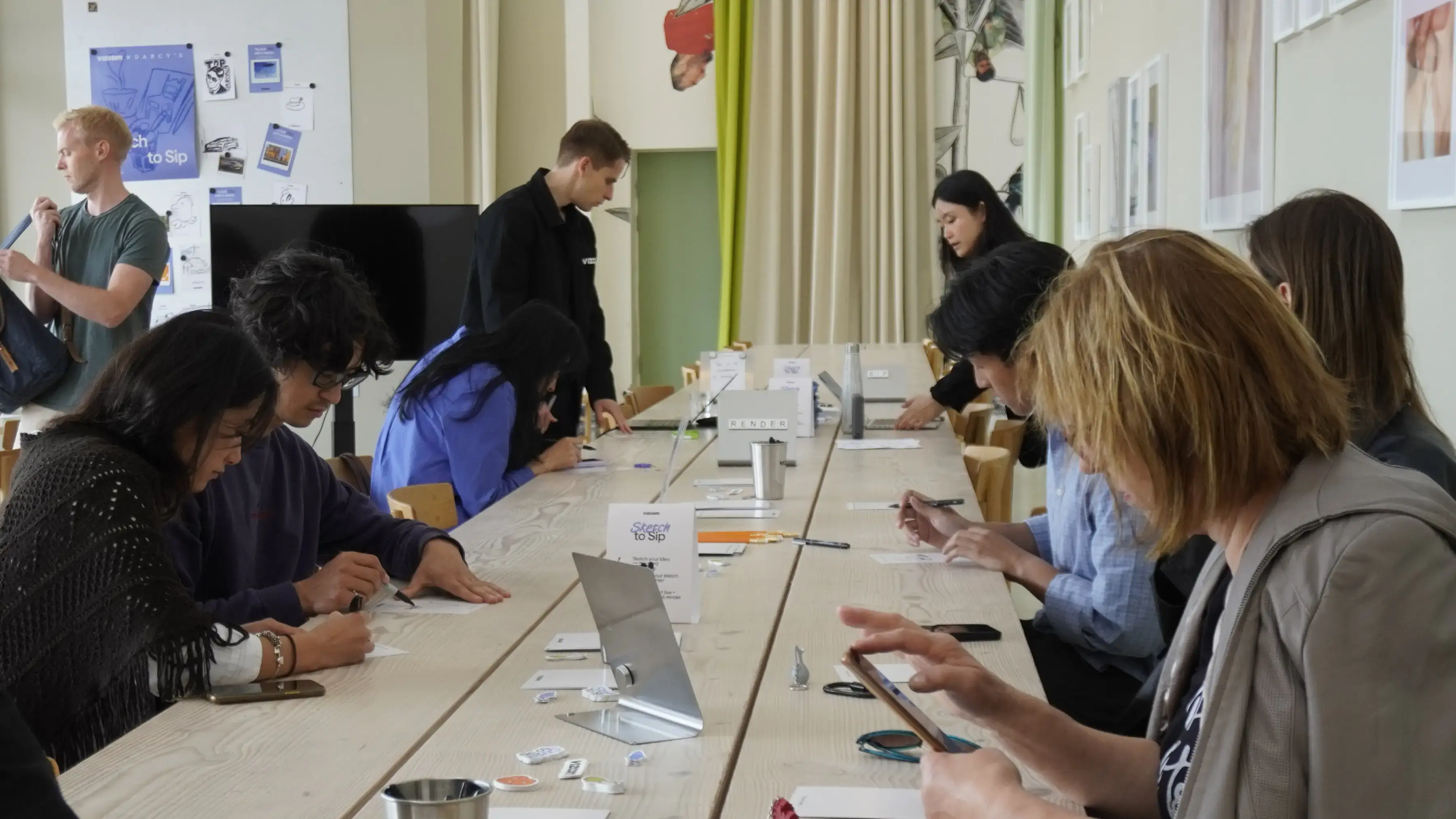
For one day during 3DaysofDesign in Copenhagen, Darcy's Cafe ran on a different currency — a sketch. Draw it, we'd render it live in Vizcom, and you'd walk out with a print — coffee included.
See how Kohler's industrial design team uses Vizcom to save time, speed up workflows, and create better work.
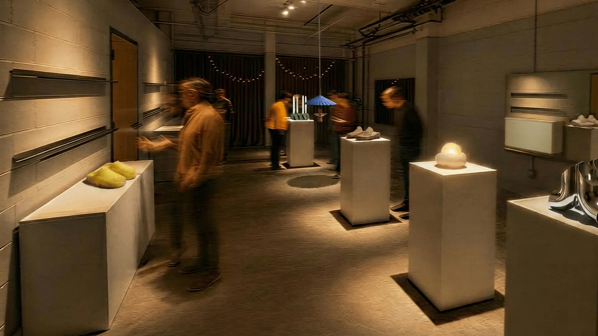
Explore the designs of Vizcom's San Francisco Design Week exhibition where furniture, footwear, lighting, and automotive concepts come to life through AI-powered visualization. Follow along as designers share the stories, sketches, and tools behind every piece on display.
Frequently asked questions
Yes of course! Our starter plan is completely free, no credit card required. This is a great plan to explore vizcom with.
We accept all major credit and debit cards.
Admins (paid) – can edit files, manage workspace settings, billing, teams, and invite members. Editors (paid) – can edit files but not manage settings, billing, or teams. Viewers (free) – can only view files in read-only mode.
Team billing is handled centrally by the Admin. All paid seats, whether Admins or Editors, are included in a single invoice under the same billing cycle, while Viewers remain free and do not affect the cost.
Yes, you can. An Admin can update the plan in the billing settings, and the switch will take effect on the next billing cycle at the annual rate.
Yes, you own everything you create in Vizcom. For free users, while Vizcom may use generated images to improve its services, it does not claim ownership of your designs, concepts, or original ideas—you keep full rights to them. For paid users, your images and designs remain entirely private and are only used to deliver the service. Every design, concept, and image you create or upload is fully yours and kept confidential.
Vizcom does not use your data to train AI models if you’re on a paid plan. Everything you create stays private and is only used to provide the service. Free users may have their generated images included to help improve Vizcom’s services, but even then, Vizcom does not claim ownership of your designs, concepts, or original ideas—you retain full rights.